Terran Stellar Navy › Forums › (OOC) Division Development › TSN Viper and Horison ship icons
This topic contains 51 replies, has 9 voices, and was last updated by Adele Mundy 7 months, 1 week ago.
-
AuthorPosts
-
29/06/2025 at 16:16 #12515
I like the Take 2. It has just enough detail that I think the first version was missing. Not as crazy about the snake, it seems too cartoony IMO.
29/06/2025 at 16:43 #12517I think the horizon should be rotated more it looks too much like a nipple when it’s side ways
29/06/2025 at 17:05 #12519Maybe use a star rather than a planet appearing over the Horizon or use horizontal parallel lines getting closer together from foreground to centrefield rather than the curve of a planet.
29/06/2025 at 17:20 #12521I agree completely, Aramond, I almost scrapped the snake entirely. It’s hard to make one simple enough for a one-color logo that doesn’t also look dumb, so any suggestions would be much appreciated.
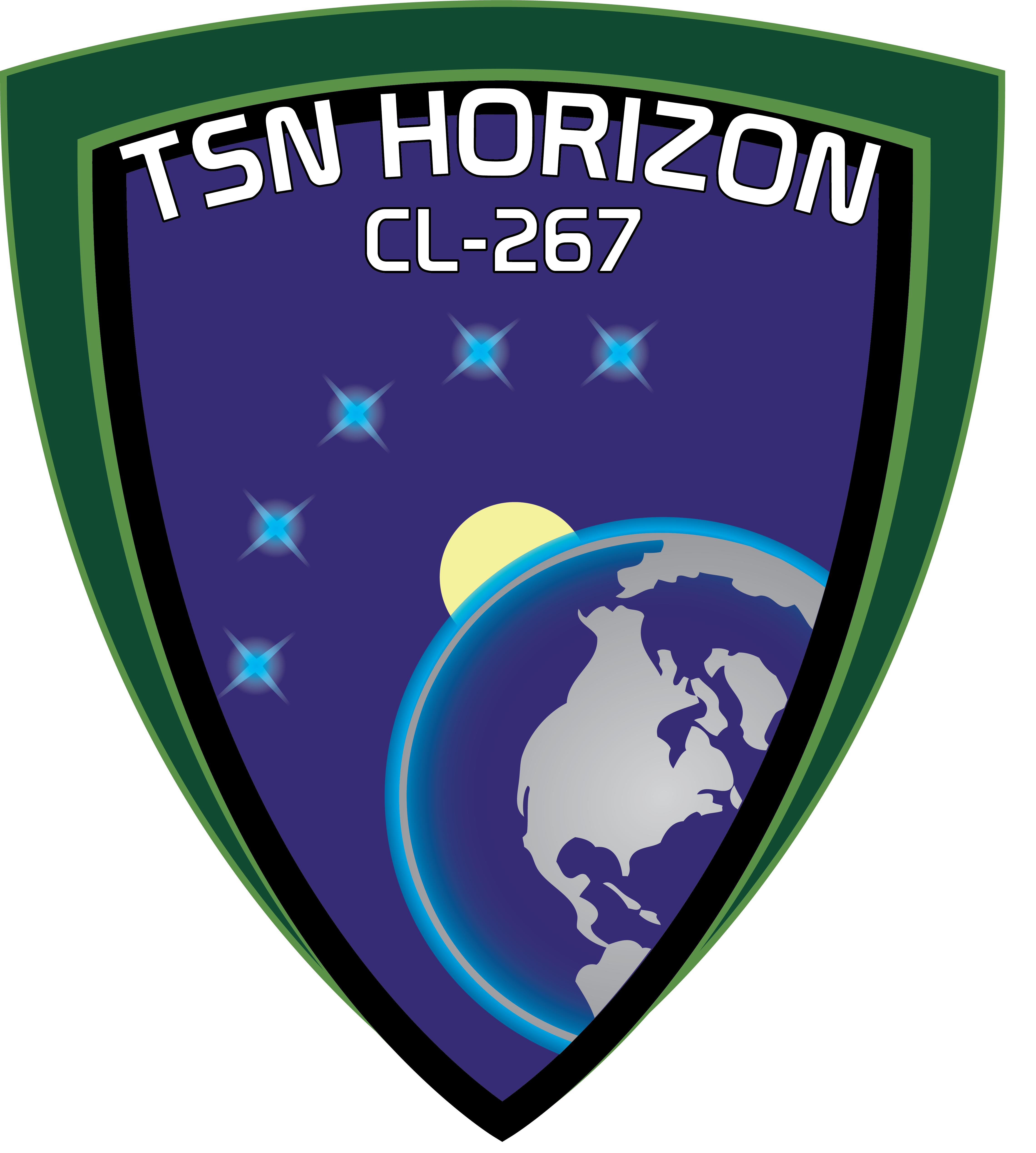
Here’s a third go at Horizon, though I like Matsiyans suggestions, maybe I’ll try them next if this one doesn’t work out.
 29/06/2025 at 18:16 #12528
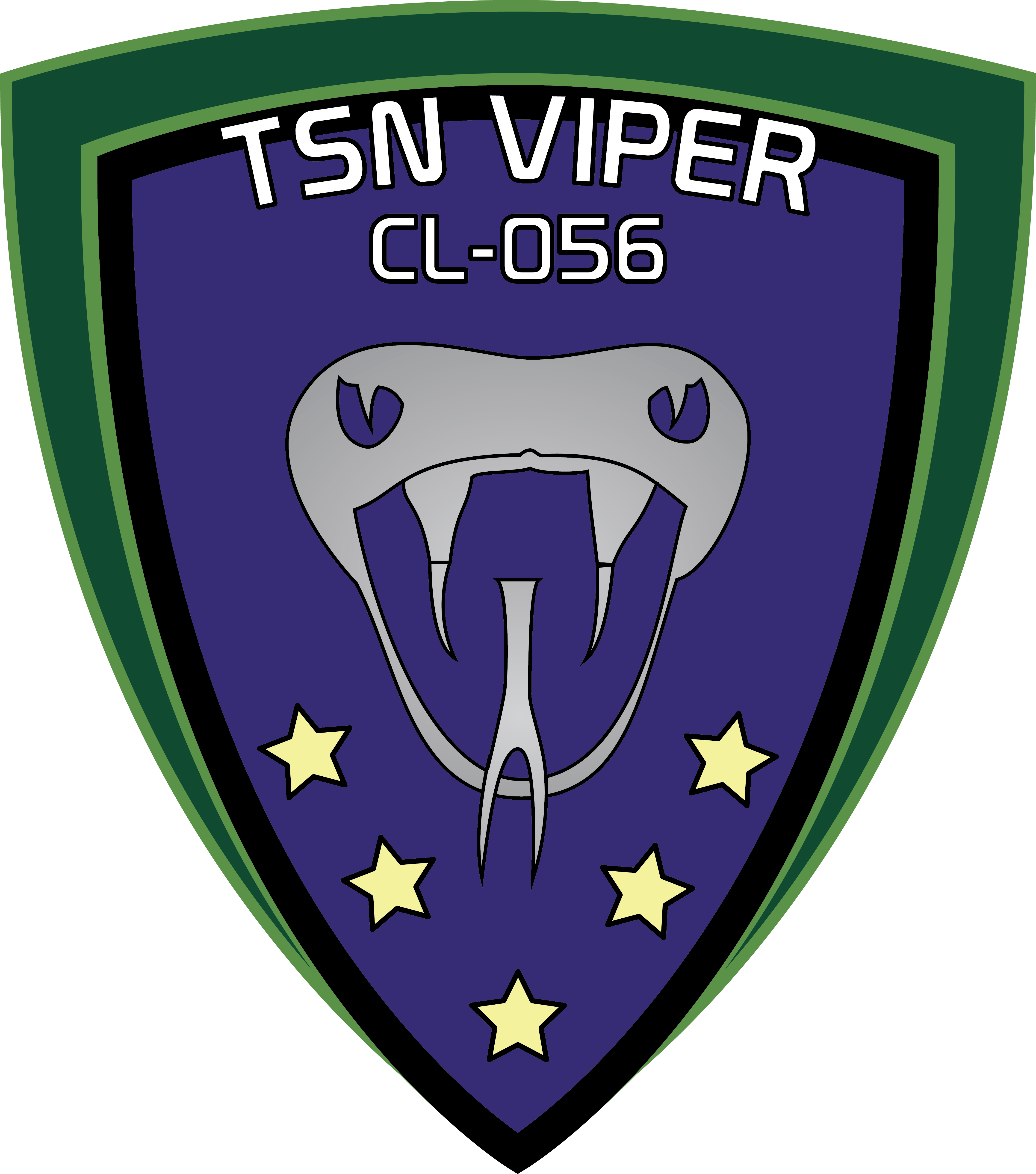
I think maybe it’s the snake’s body that’s the goofiest looking, what do you think about this one without the body?
 29/06/2025 at 18:31 #12530
I agree it looks better without the body. I am reluctant to go googling snake images, but I think one of the characteristcs of the viper is a sort of bump on its snout, if you want to make it more viper-like.
Not that I want to criticise, since I have no idea how to even start putting together an image like that.29/06/2025 at 18:54 #12532Yeah, it does look better without a body. I thought the body was made to look spiral like a black hole.
The new TSN Horizon’s shield looks more colorful than the rest of the shields, right? Is it too much?
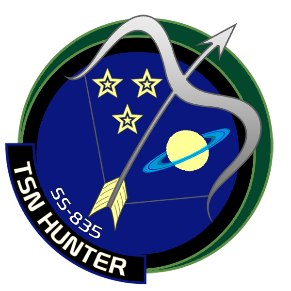
29/06/2025 at 19:02 #12534For comparison, the Hunter’s logo is pretty colorful, but I could probably simplify it if need be:
 29/06/2025 at 19:27 #12536
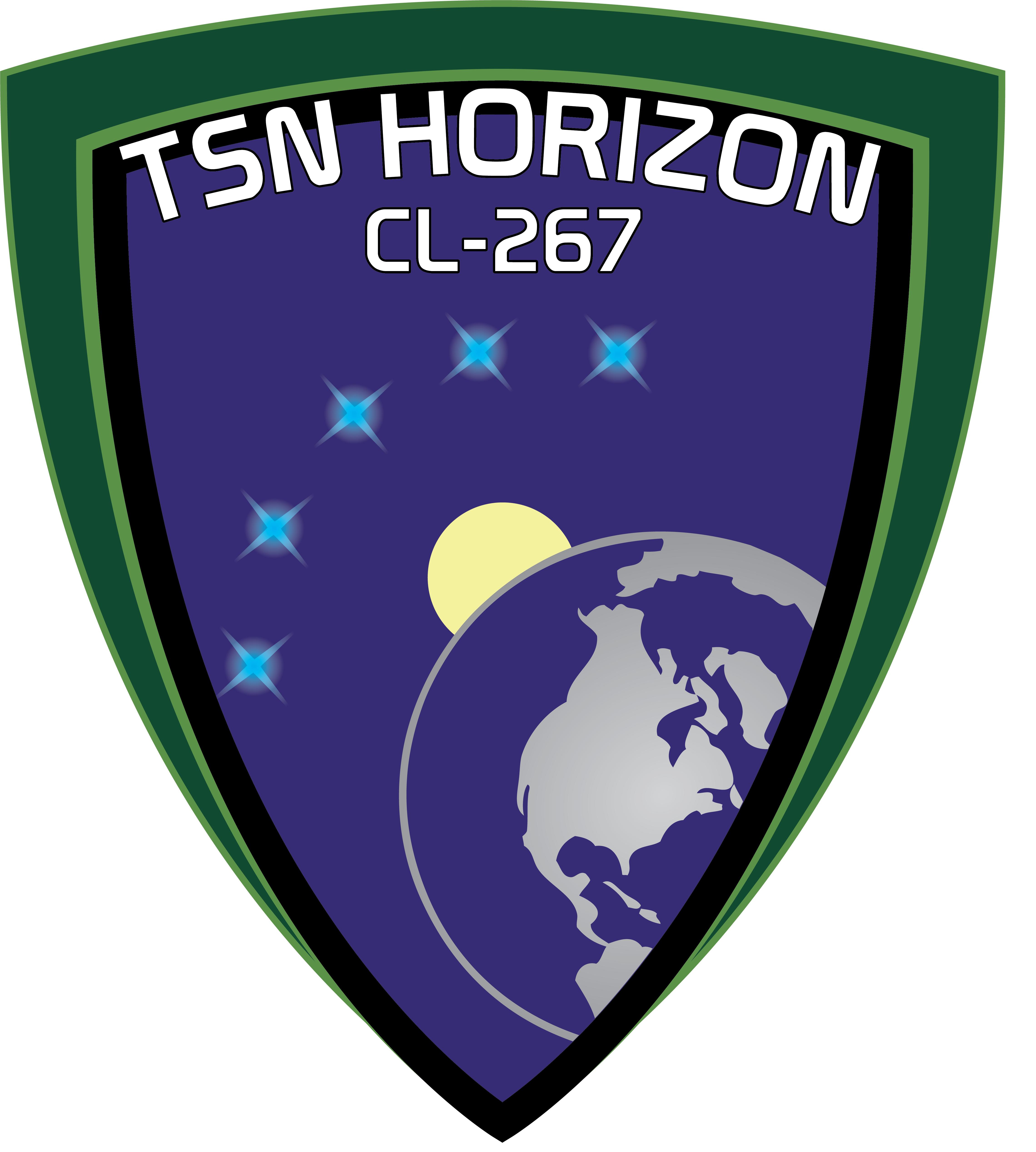
Here’s Horizon 3 without the atmosphere, which should simplify it significantly:
Horizon 4
Horizon 5
 29/06/2025 at 19:36 #12538
You’ve really done a lot, Quinn. 🙂
Good work!
Proud to serve with you!
29/06/2025 at 20:09 #12540I like the paler blue for the ocean. Great work, Quinn!
29/06/2025 at 21:35 #12543What if you did some sort of top down view for the snake? Don’t click that link, Mundy.
29/06/2025 at 21:49 #12545I like Horizon 5 a lot and the snake head without the body.
29/06/2025 at 22:17 #12547*in a Gollum-voice*
I’m not clicking! I’m not clicking!Thanks for the warning 🙂
Years ago, when I though I just had the same, sensible uneasiness about reptiles that most humans have, I had the bright idea of creating a character with ophidophobia, in a fantasy world with lots of giant snakes. The game was run under GURPS, and their rules for failing a Will save vs. phobia were quite detailed. My character spent significant portions of monster fights either running away or frozen in terror…
Years later, ophidophile friends proudly showed me their new pet (non-venomous) snake. And I found out that the GURPS rules were entirely accurate, as I failed my RL Will save.
30/06/2025 at 02:29 #12556 -
AuthorPosts
You must be logged in to reply to this topic.